-
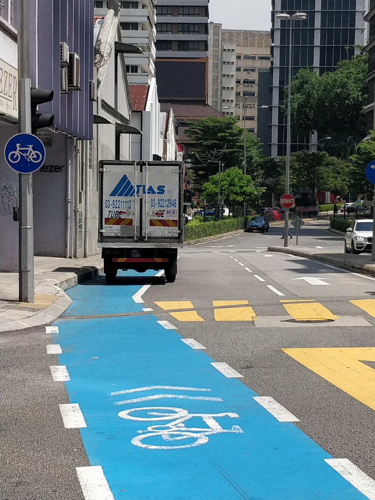
Change society, not (only) infrastructure!
An essay I wrote for the “Unraveling the cycling city” MOOC of the University of Amsterdam
-
Cartogram Plugin for QGIS3
I rewrote a popular plugin for QGIS3 -> better performance, more features
-
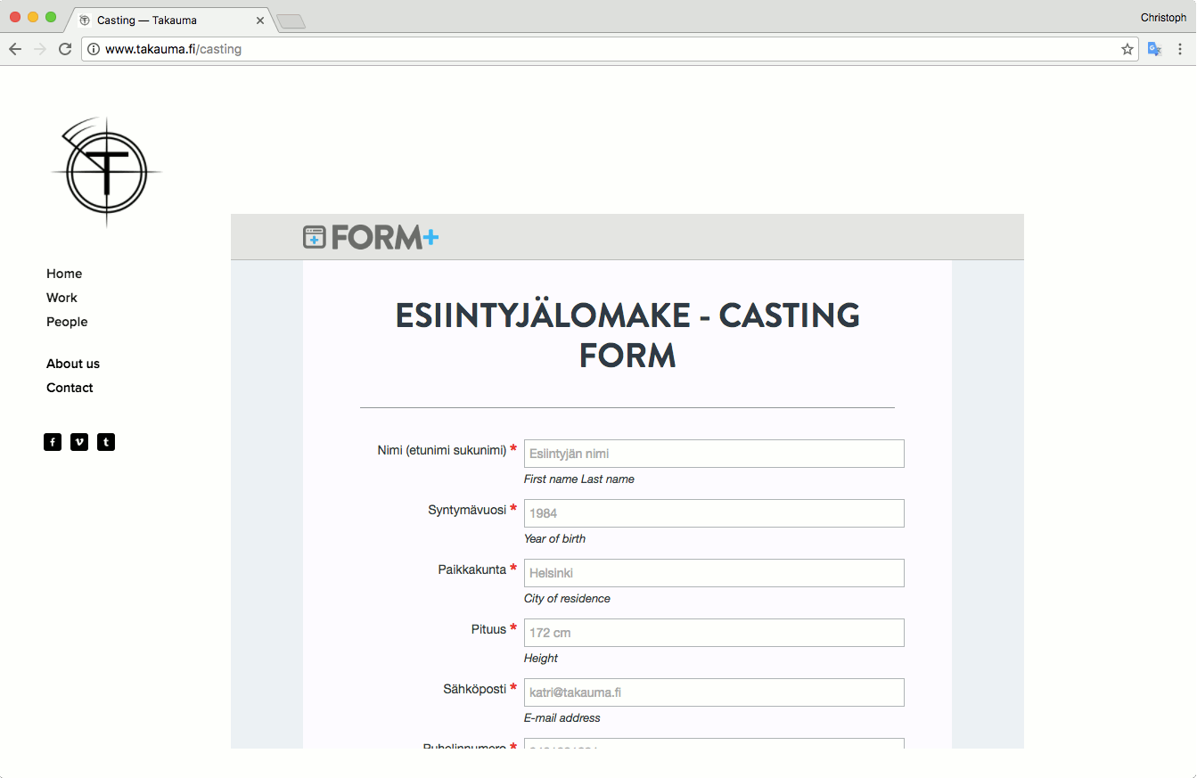
Helsinki Street Casting: a Google Apps Script love story
Uploading directly to Google Drive and Spreadsheets
-
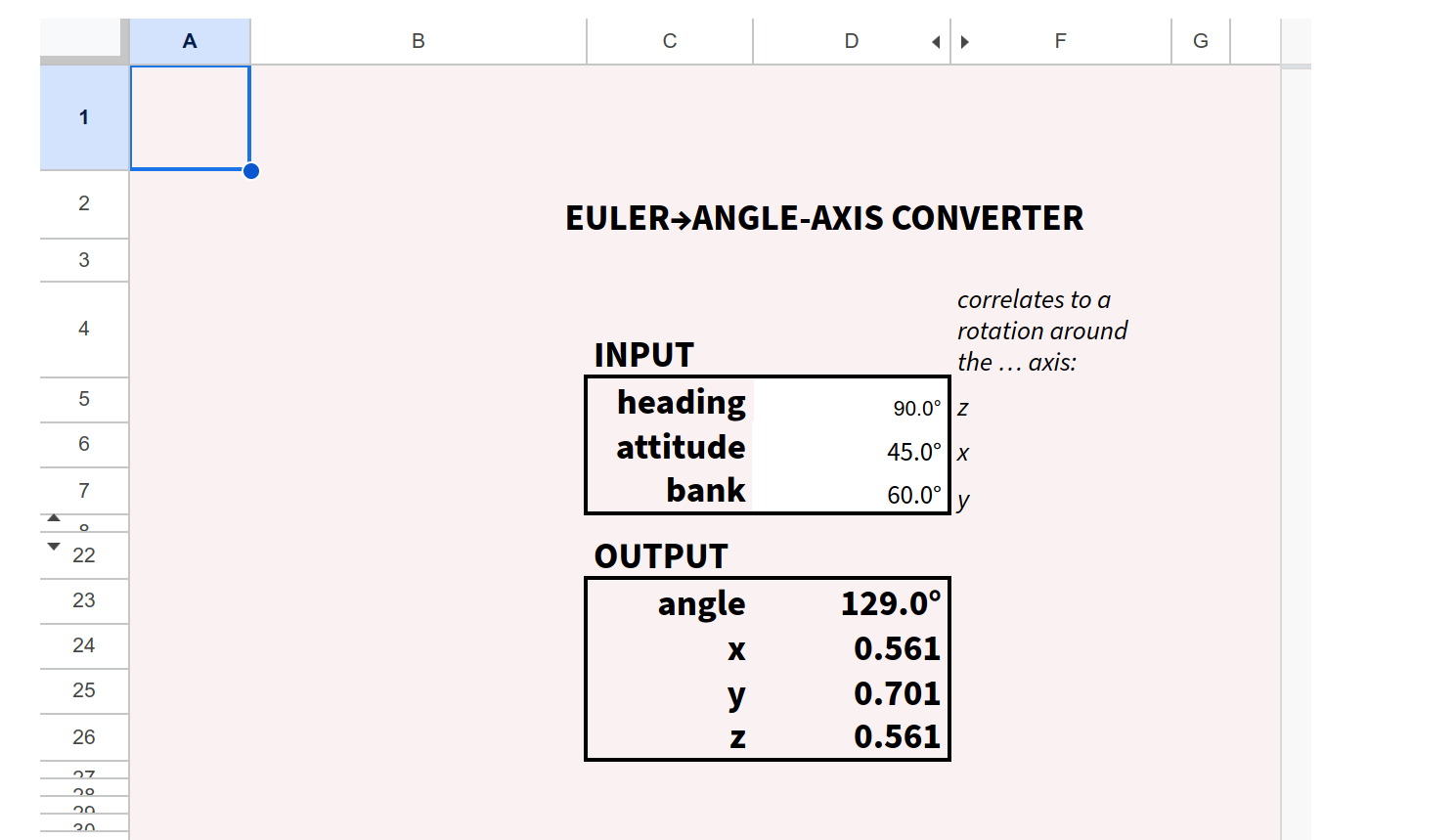
Euler to Axis-Angle converter
convert 3D component rotations to an angle-axis representation
-
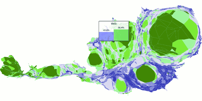
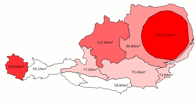
austromorph.space
anamorphic maps to represent Austria’s social topography
-
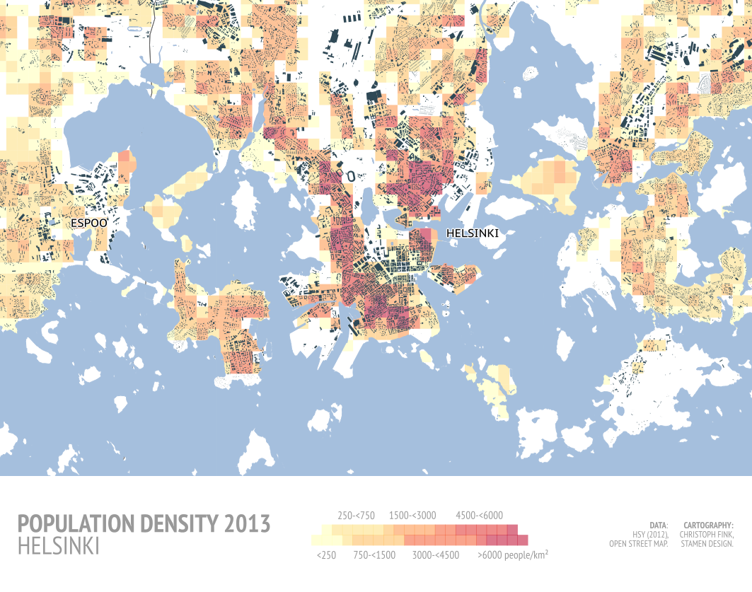
Helsinki Population Trends
A bunch of nice maps and charts. Watch out for their legends!